> For the complete documentation index, see [llms.txt](https://tekos.gitbook.io/doc/llms.txt). Markdown versions of documentation pages are available by appending `.md` to page URLs; this page is available as [Markdown](https://tekos.gitbook.io/doc/building-apps-1/chat-surfaces/modals-adaptive-cards/building-an-adaptive-card.md).
# Building An Adaptive Card
To create AdaptiveCard you need to use microsoft platform: [Adaptive Card Designer](https://adaptivecards.io/designer/)
All Cards are built in the JSON scheme in which you can edit specified elements straight in the code, but the Microsoft platform allows you to use the drag and drop method together with configuration menu.
## Adaptive Cards Designer interface
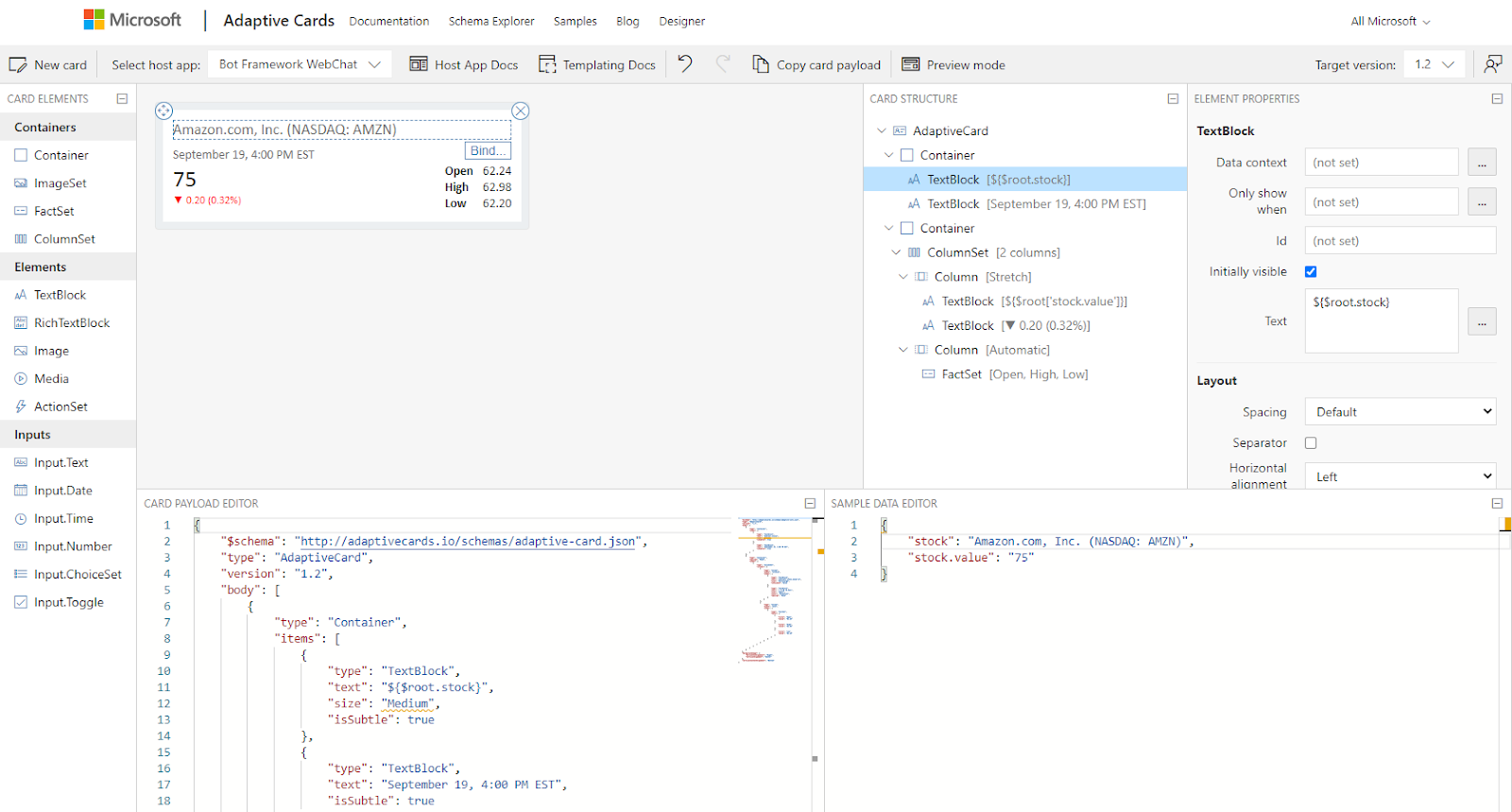
Adaptive Cards builder can be split into 6 parts but for tekos uses only 5 of them
1. Left side menu with **Card Elements**. \
Here you can find all elements of which the adaptive card can be built with. Like TextBlock, Images, All kinds of Inputs and other elements.
2. **Working Area** of your card\
It is the place to show how your card will look like. \  3. **Card structure** \
Defines the drag and drop structure of your card
3. **Card structure** \
Defines the drag and drop structure of your card
4. **Element Properties**\
Whenever you pick an element from the Working area or Card structure you will get additional information about the selected element. Like the Id, Text, Styling, Layout and action types but will discuss them more in the future.
5. **Card Payload Editor**\
This is the code representation of the card structure and this is the part needed for the tekos flow to get cards working in the chat.
6. **Sample Data Editor** (we don’t use that one in the tekos flow)
## Content of your first Adaptive Card

You might be already familiar with card it's showing the Amazon stock at exact day\
So we will use it as an example
Here you can see the card code in the CARD PAYLOAD EDITOR:
```javascript
{
"$schema":"http://adaptivecards.io/schemas/adaptive-card.json",
"type":"AdaptiveCard",
"version":"1.2",
"body":[
{
"type":"Container",
"items":[
{
"type":"TextBlock",
"text":"Amazon.com, Inc. (NASDAQ: AMZN)",
"size":"Medium",
"isSubtle":true
},
{
"type":"TextBlock",
"text":"September 19, 4:00 PM EST",
"isSubtle":true
}
]
},
{
"type":"Container",
"spacing":"None",
"items":[
{
"type":"ColumnSet",
"columns":[
{
"type":"Column",
"width":"stretch",
"items":[
{
"type":"TextBlock",
"text":"75",
"size":"ExtraLarge",
"isVisible":false
},
{
"type":"TextBlock",
"text":"▼ 0.20 (0.32%)",
"size":"Small",
"color":"Attention",
"spacing":"None"
}
]
},
{
"type":"Column",
"width":"auto",
"items":[
{
"type":"FactSet",
"facts":[
{
"title":"Open",
"value":"62.24"
},
{
"title":"High",
"value":"62.98"
},
{
"title":"Low",
"value":"62.20"
}
]
}
]
}
]
}
]
}
],
"backgroundImage":{
"horizontalAlignment":"Right",
"verticalAlignment":"Center"
},
"verticalContentAlignment":"Bottom"
}
```
As you can see it’s a JSON code representation of the Card Structure.
We can specify the Containers, Columns, TextBlock, FactSet etc.\
Each of them contain different properties like value, title, width, color, spacing etc. all
---
# Agent Instructions
This documentation is published with GitBook. GitBook is the documentation platform designed so that both humans and AI agents can read, navigate, and reason over technical content effectively. Learn more at gitbook.com.
## Querying This Documentation
If you need additional information that is not directly available in this page, you can query the documentation dynamically by asking a question.
Perform an HTTP GET request on the current page URL with the `ask` query parameter:
```
GET https://tekos.gitbook.io/doc/building-apps-1/chat-surfaces/modals-adaptive-cards/building-an-adaptive-card.md?ask=
```
The question should be specific, self-contained, and written in natural language.
The response will contain a direct answer to the question and relevant excerpts and sources from the documentation.
Use this mechanism when the answer is not explicitly present in the current page, you need clarification or additional context, or you want to retrieve related documentation sections.